From houses to homes
De Sleutels
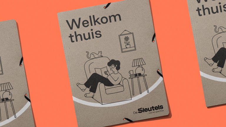
De Sleutels is a social housing corporation in Leiden, a city in South Holland. “De Sleutels” means “The Keys” in Dutch, referring to everyone’s right to shelter: keys to your own front door. But Holland suffers from a severe housing shortage, so the corporation’s 8,000 houses weren’t enough to help those on lower incomes. De Sleutels responded by building new homes, a pivot from its traditional role as landlord. As part of this shift, De Sleutels worked with JUST to create a visual identity. The goal? Direct, friendly communications for tenants plus a more serious (but still friendly) tone for business purposes. De Sleutels wanted to preserve its tagline “voor een goed thuis” for a good home.” This provided a foundation for our creative efforts.
The Key To The Keys
As always, we began by reducing a complex brief to a straightforward insight. In this case, we noted that “a good home” takes time. It’s a process, often a confusing one. A journey that begins long before the tenant picks a new sofa, involving waiting lists, income checks and much paperwork. Housing professionals don’t have it much easier. Their work involves a myriad of topics: navigating architects' plans, funding proposals, and so on. If we could clarify these formidable procedures for all involved, providing good homes would become less daunting, perhaps even fun.

Complexity, Curiosity, Simplicity, Surprise
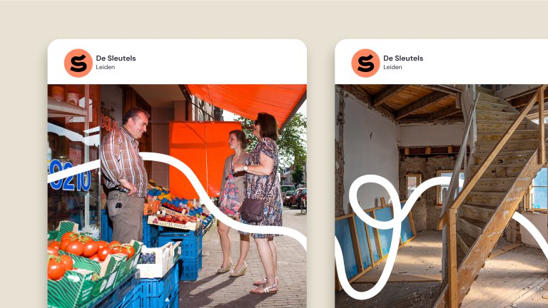
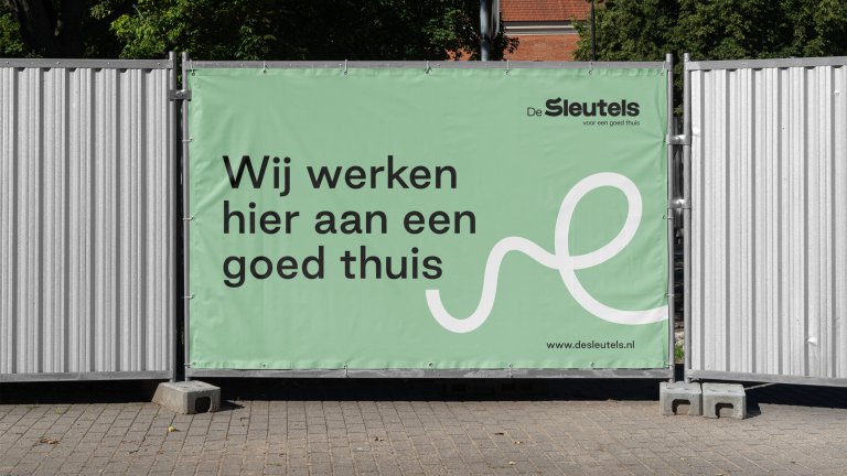
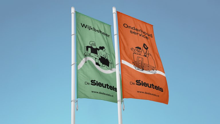
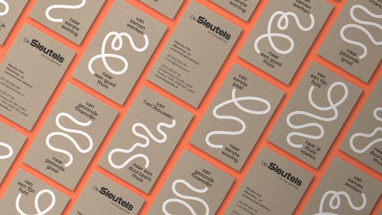
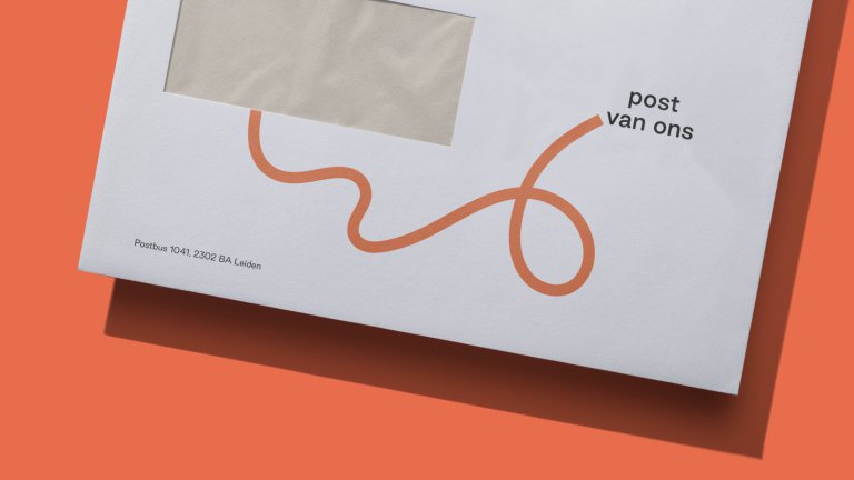
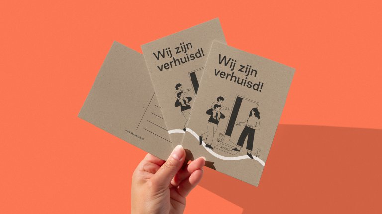
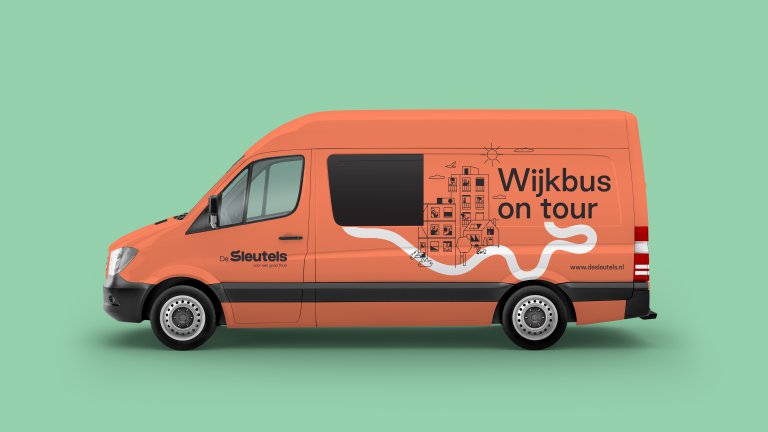
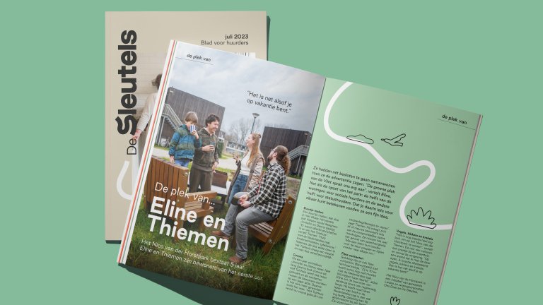
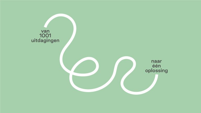
Curiosity drives us to investigate every aspect of a client's problem. Having studied the intricacies of social housing, we developed a core for De Sleutels’ visual identity. Again, the intention was simplicity, the force behind our most surprising solutions. For De Sleutels, simplicity meant minimalism: a curving line symbolizing the winding route to a good home. The line was combined with typography and paired-down illustrations, courtesy of the quick minds and talented pens at Fried Cactus Studio. The result? A less corporate housing corporation: branding that puts people before business.
